Ui sans
font-sansAa0123456789
Söhne
Headings, body text, labels, fields, and controls.
300 / 400 / 600 / 700 / 800Regular
400Söhne is used for headings and interface text.
font-sansAa0123456789
Headings, body text, labels, fields, and controls.
300 / 400 / 600 / 700 / 800400font-displayAa0123456789
Optional wide display theme. Not used for this page’s headings.
700700font-serifAa0123456789
Optional serif display themes for firm page titles.
100 / 300 / 700 / 800 / 900300Firm display theme
Firms choose a display font for their workspace. It applies to headings throughout the app.
Harbor House
Light
300
Sphinx of black quartz
Regular
400
Sphinx of black quartz
Semibold
600
Sphinx of black quartz
Bold
700
Sphinx of black quartz
ExtraBold
800
Sphinx of black quartz
Thin
100
Harbor House
Light
300
Harbor House
Bold
700
Harbor House
Black
900
Harbor House
Neutral surfaces, brand accent, and semantic status. Colors come from Tailwind.
Neutral
50
#fafafa100
#f5f5f5150
oklch(94.6% 0 0)200
#e5e5e5300
#d4d4d4400
#a3a3a3500
#737373600
#525252700
#404040800
#262626900
#171717950
#0a0a0aMeaning
Accent
Brand only#E62E10Success
Quote, profit, placed#0f766eWarning
Lock, attention#b45309Error
Archive, destructive#be185dFour levels establish depth across the operator UI.
Tertiary · Page canvas
Secondary · Content column
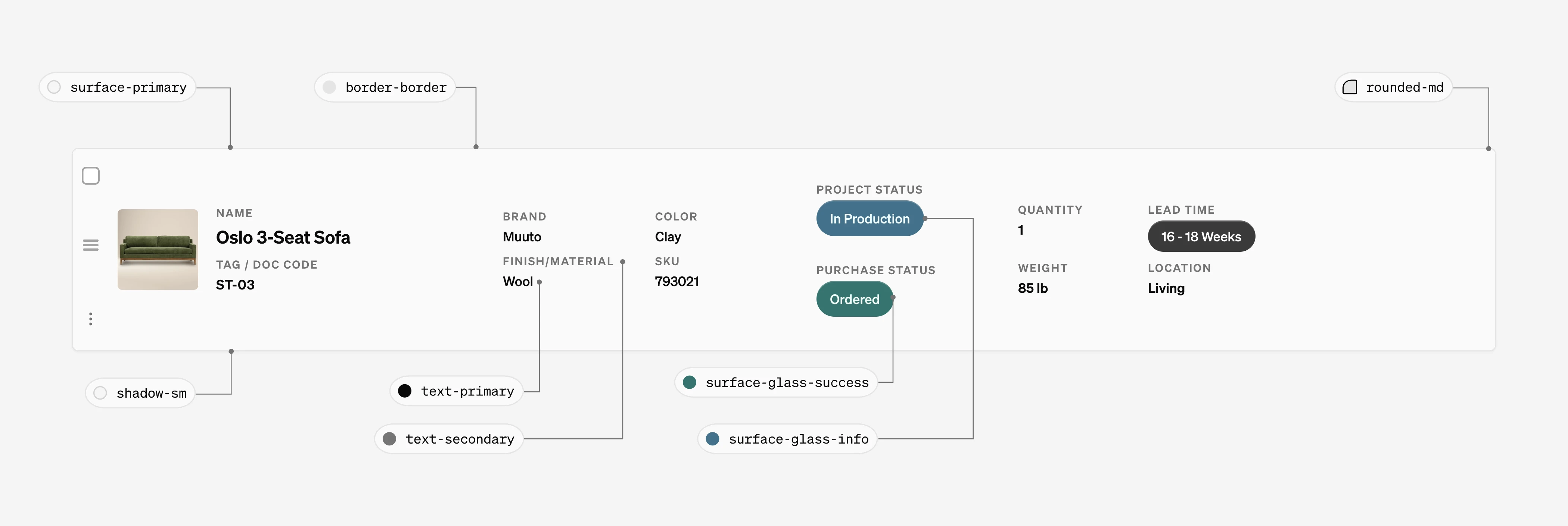
Primary · Card / Schedule item
Surface hierarchy
primary
Cards, sidebar, schedule itemssecondary
Content columntertiary
Page canvasactive
Nav active, selectionGlass 80
Primary
Glass 39
Secondary
Glass 30
Tertiary
Live product components with their states and APIs.
UIComponents/Button.svelteActions throughout the operator UI. Variant communicates role; label names the action.
Variants
Sizes
States
variant neutral | light | icon | success | error | warning | misc | cyan | indigo | blue | purple | underline | custom neutral Visual role and color.size tiny | small | medium | large | tiny-icon | small-icon | tiny-icon-square | custom small Control height and padding.label string "" Visible action label.icon string "" Icon name.iconPosition left | right left Icon placement.showStatus boolean false Shows temporary success or error feedback after the action.status idle | success | error | warning idle Bindable feedback state.disabled boolean false Prevents interaction.fullWidth boolean false Fills the available width.onClick () => void | Promise<void> () => {} Action handler.UIComponents/Checkbox.svelteSelection control used by RowActions on schedule items.
checked boolean false Bindable selection state.id string required Associates input and label.disabled boolean false Prevents selection.onChange (checked: boolean) => void undefined Runs after the value changes.UIComponents/Switch.svelteImmediate on/off setting. Label describes the on state.
toggleOn boolean false Bindable on state.label string "" Describes the on state.activeColor string surface-glass-success Track token when on.disabled boolean false Prevents interaction.onClick () => void undefined Runs after toggle.UIComponents/Tag.svelteCompact status display. Use canonical status labels; color follows meaning.
Glass
Flat and muted
variant glass | flat glass Glass for chrome; flat for dense lists.tagColor surface-glass-* | secondary "" Semantic surface token.label string "" Visible status label.icon string "" Optional leading icon.flatSize normal | large normal Flat-tag density.title string "" Native hover description.UIComponents/ToggleTabs.svelteSwitches between peer views without navigation. selectedId is the single source of truth.
tabs Array<{ id, label?, icon? }> [] Ordered segments.selectedId string "" Bindable active segment.onchange (id: string) => void undefined Runs after selection.class_name string "" Classes applied to the root.cells/table/components/TableInput.svelteInline editing on schedule items. Enter or blur commits; Escape cancels.
Default
Percentage
Locked
label string required Field label.value string | number "" Bindable field value.type string text Native input type.percentage boolean false Appends % when unfocused.rows number undefined Renders a textarea when greater than 1.locked boolean false Read-only with the schedule lock notice.onCommit ({ value: string }) => void undefined Runs on changed blur or Enter.onCancel () => void undefined Runs on Escape.